Building a scalable design system for Mocaas and the DesktopIP ecosystem.
Building a scalable design system for Mocaas and the DesktopIP ecosystem.
Product designer
Jan 23 - Jul 25
Tokenization, Component library, Design Documentation

4 products, 1 source of truth.
4 products, 1 source of truth.
DesktopIP ecosystem has 4 products, but their visual identities were completely disconnected. This fragmentation failed to reflect the unified ecosystem we were building. I led the development of a design system to establish a uniform style that aligns all products under a single visual language.
I audited our assets to build a core design system for Mocaas. By defining foundational components and reusable patterns, we established the baseline needed for a scalable and predictable interface.
This phase focused on creating a flexible system that enabled seamless collaboration. We built it to be easily maintained and to support new components, ensuring our shared language remained consistent even as the product grow.
The implementation of the design system allowed the team to focus on solving user problems rather than fixing visual inconsistencies.
- Accelerated Handoff: Design delivery became ~200% faster with a centralized component library and established patterns.
- Atomic Design: We applied atomic design principles to build 16 core components and 240+ variants for Mocaas, ensuring a flexible and cohesive library.
- Tokenization: Design tokens removed the guesswork from handoffs and ensured visual consistency across all four brands.

Inventorying components to identify patterns.
Inventorying components to identify patterns.
To build a unified system, I first needed to pinpoint the exact areas of inconsistency. I audited and inventoried every component to understand our existing patterns and identify the gaps in our interface.
-
Multiple styles, text weights, and sizes were used for buttons and badges.

-
Banners and toggles did not use consistent colors to convey messages such as active, success, error, or information.

-
Lack of consistency in style for building the components, in example border were using different color and border radius.

-
Modals and checklists were styled inconsistently across different pages.

Bridging the gap between design and engineering.
Bridging the gap between design and engineering.
A design system's true value lies in its practical application. To ensure our efforts extended beyond Figma, I organized a workshop for designers, engineers, and product managers to align our goals and establish clear expectations.
The session began with an overview of the system's architecture, followed by a live demonstration of our button component. This included its structure in Figma and corresponding documentation in Zeroheight. We wrapped up with an open discussion about our workflow.
- Foundation Introduction: We explored the what, why, and how of the system to ensure everyone understood its long-term value.
- Goal Alignment: The team agreed on creating a system that emphasized consistency and scalability throughout the entire ecosystem.
- Real Case Study: We discussed the real world usability of the system, ensuring the components were technically feasible for engineers to implement.

Atomic design for a scalable, modular UI.
Atomic design for a scalable, modular UI.
By adopting Brad Frost's Atomic Design methodology, we structured our component architecture around the smallest, most functional units. This foundational approach allowed us to build a system where larger components and complex interfaces remained consistent and easy to scale.
- Reusable Pattern: It provides a structured approach to organizing components, ensuring that patterns are consistently reused rather than being reinvented.
- Consistency: By integrating smaller components into larger ones, any update to a foundational element seamlessly propagates throughout the entire product.
- Streamlined Onboarding: The hierarchical structure makes the process simpler for new designers and developers, enabling them to quickly grasp the library and start contributing effectively.

Tokenization as the single source of truth.
Tokenization as the single source of truth.
To ensure designers and engineers refer to the same elements during handoff, we implemented design tokens. This approach guarantees that both teams use the same variables, eliminating the confusion of hard-coded values.
- Single Source of Truth: It creates a unified language shared between Figma and the codebase, ensuring what is designed is exactly what is built.
- Reduced Handoff Friction: By using named tokens (e.g., button-primary-bg) instead of raw hex codes, we significantly reduced manual errors during the handoff process.
- Automated Updates: Tokens enable global updates. When a variable changes, the update reflected through the entire ecosystem automatically.

Implementing local variables for Figma
Implementing local variables for Figma
In Figma's Config 2023 keynote, Local Variables for the Design System are introduced. We implemented this feature to store values for design elements.
Adapting 1 system for 4 distinct brands.
Adapting 1 system for 4 distinct brands.
The challenge was to maintain a uniform ecosystem while respecting each product’s unique brand identity. To solve this, we evolved our token architecture to handle brand-specific styling without duplicating the core component library.
- Brand Color Token: We shifted from a single primary color to multiple by nest four primary color to a brand token via Theme in Figma
- Accommodate the New Products: We expanded our component library to integrate the three additional products alongside Mocaas.
- Collaborative Maintenance: I led a team of four designers to refine the token structure and ensure the system remained flexible enough for each product.

As we finalized the design token and began building the multi-brand components, the project was put on hold indefinitely due to company inactivity. However, the foundation we built remains a scalable blueprint for future development.
Color: Text
Color: Text
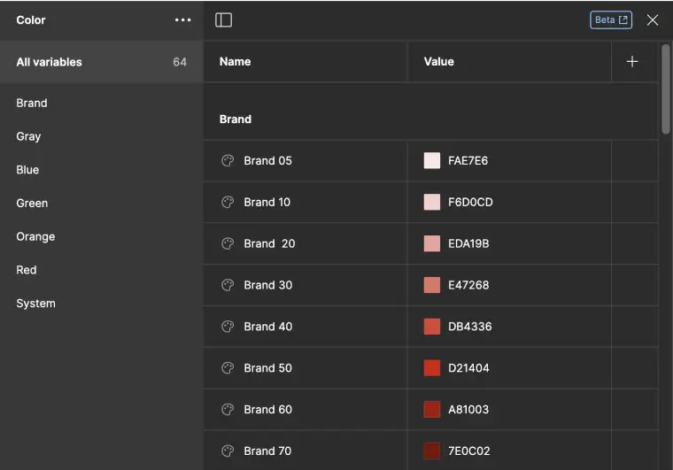
Red Mocaas (HEX #D21404) as primary color and complemented by a neutral gray.


Typography
Typography
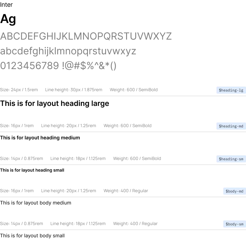
Use Inter typeface in Regular and Semi-Bold weights, with a base size of 16px.

Spacing
Spacing
Follows a 4px grid to maintain consistency.


Icon
Icon
We use Font Awesome, with 24px as the standard size and 16px for the small size.
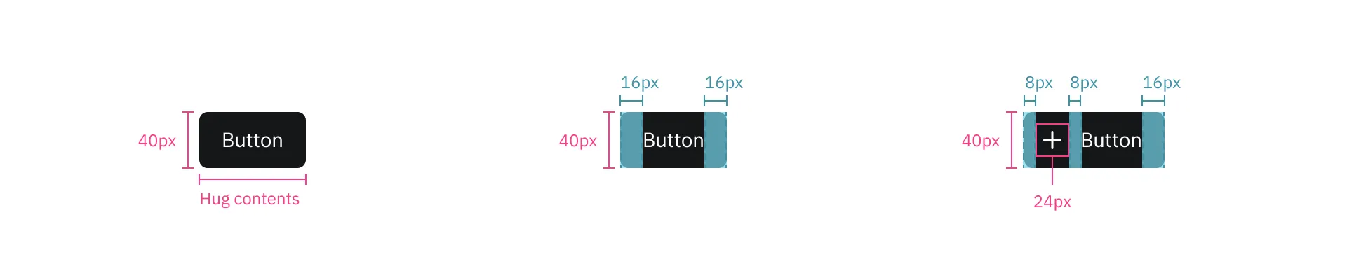
Button
Button
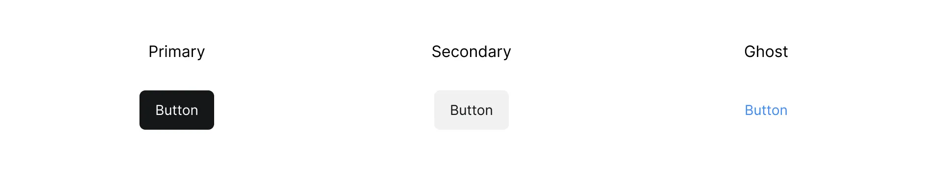
Buttons are interactive elements that trigger actions when clicked. Mocaas includes 3 style to indicate hierarchy.
- Can contain an optional leading icon
- Icon: standard size icon of 24px
- Types: primary, secondary and ghost
- Keep labels concise and in sentence-case
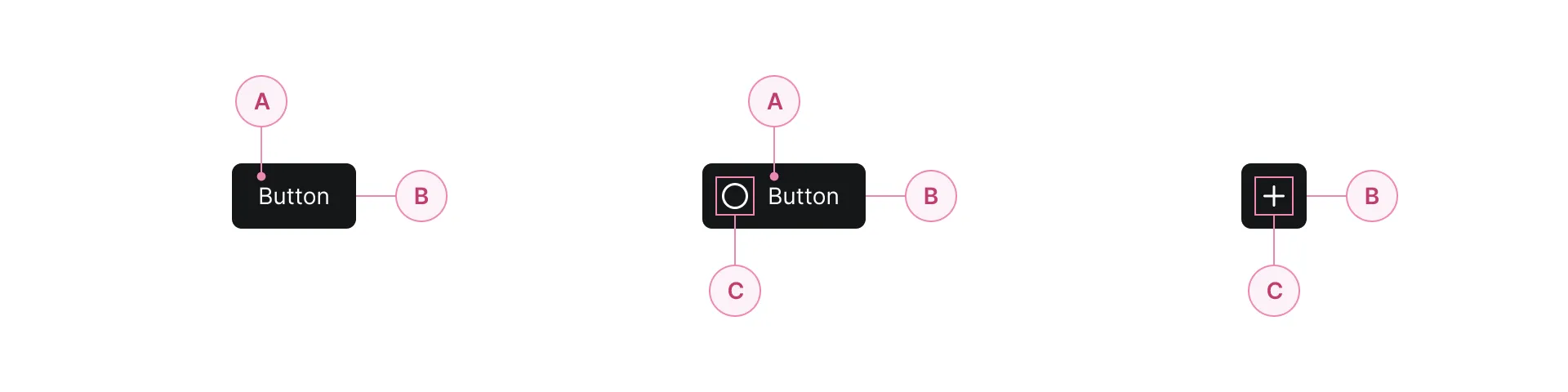
- Label text
- Container
- Icon

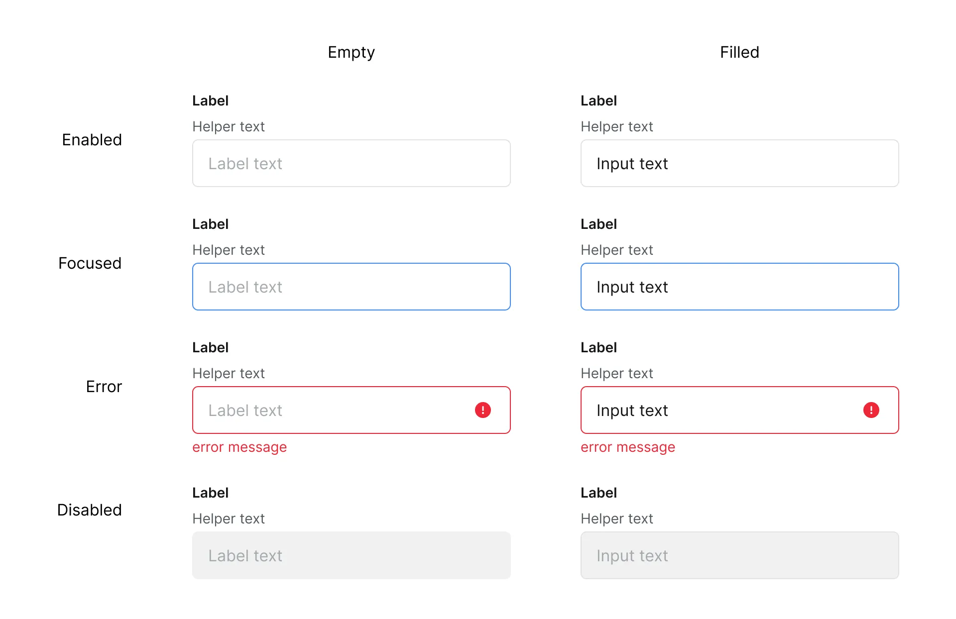
Text Input
Text Input
Text inputs allow users to enter and edit text-based data. They can be used for inputs like names and emails or longer inputs like comments.
- Can contain an optional trailing icon
- Icon: standard size icon of 24px
- Types: enabled, focus, error and disabled
- Keep labels concise and in sentence-case

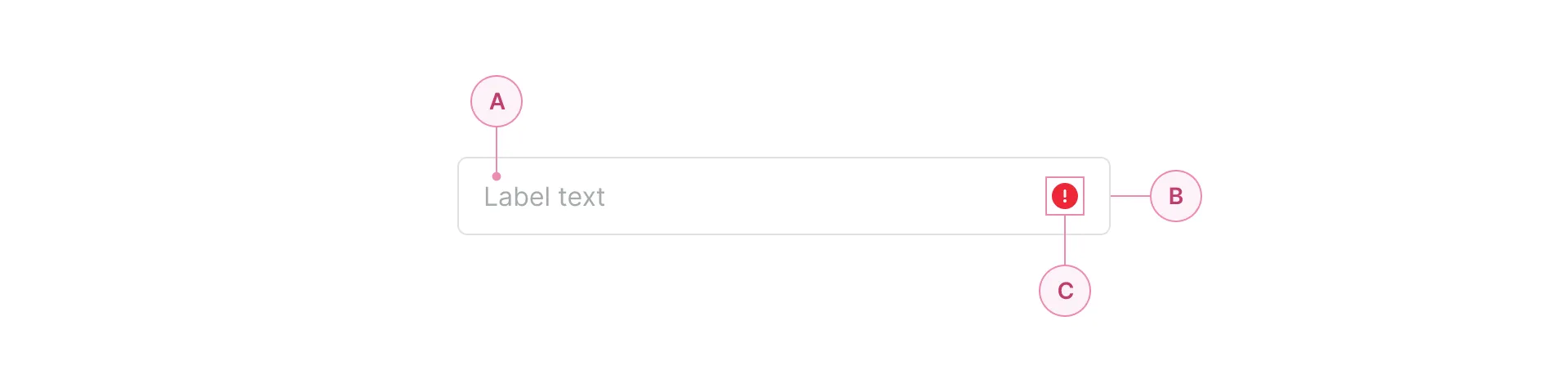
- Label text
- Container
- Icon

and other components...
and other components...
Build a good foundation and maintain it
Build a good foundation and maintain it
After we finish create the 1.0 of the design system, the task is not yet done. Now we need to continue maintain it as design system is a living documents.

Prioritize clarity
More isn’t always better. Restructured the form taught me to prioritize what users need and remove distractions .
Design for familiarity
Aligning with the users’ mental model boosts usability and trust. By doing this, we made the transition feel natural.