
Bridging the gap between advanced tooling and user simplicity
Bridging the gap between advanced tooling and user simplicity
Role
Product designer
Timeline
Feb - Mar 2023
What I do
User research, Interaction design, Prototype (React)

TL;DR
Redesigning a global video platform for local user expectations after pivot.
Redesigning a global video platform for local user expectations after pivot.

Mocaas
Mocaas is a no-code web storefront builder that helps creators to own their presence and monetize content through subscriptions, rentals, and one-time purchases.
The Pivot
We originally planned to hire a US-based agency to launch the product globally. When we realized that strategy wasn't viable, we pivoted to Indonesia to leverage our team’s local expertise.
The Problem
While the team was local, the product wasn't. The platform was built on US standards, from payment flows to complex publishing steps. This made it feel completely foreign to the expectations and daily habits of Indonesian creators.

Problem 1 : The Value Gap
Creators mistook Mocaas for a social media platform...
Creators mistook Mocaas for a social media platform...
Because the platform was modeled after US video-on-demand services, local creators initially viewed it as another YouTube or Instagram. They expected to be posting content under an existing platform rather than building their own independent storefront.

"Is Mocaas like YouTube? Will my videos show up in a home feed for people to find?"

"Why should I pay a monthly fee if I can just use social media for free?"

"Where do the viewers come from? Do I have to share the link myself every time?"
...leading them to question why they should pay for a "free" service.
...leading them to question why they should pay for a "free" service.
This created a fundamental misunderstanding of the value proposition: they expected Mocaas to provide an audience via an algorithm. When they realized they had to bring their own followers, they became skeptical of the cost.
Problem 2 : Technical Friction
A complex, multi-step publishing flow caused creators to abandon the platform before their first upload.
A complex, multi-step publishing flow caused creators to abandon the platform before their first upload.
The original process was designed for a complex publishing videos to a dedicated website page, which required several configuration steps.
During testing, Indonesian creators failed to complete the process because there were too many steps and the fields asked didn't make sense to them. This leads to users grew frustrated and dropped off before reaching the final stage.
Navigating the Mess
Where does Mocaas fit in the current market?
Where does Mocaas fit in the current market?
I mapped out the existing ecosystem. I categorized the products into three distinct groups based on their market positioning and how they influence creator expectations:
- Global direct competitors (Kajabi, Uscreen): These offer high control and personal websites but lack local payment integrations and organic reach.
- Indirect local competitors (TipTip, KaryaKarsa): These excel in local payments and discoverability but do not offer creators a "Personal Website" presence.
- Similar social platforms (YouTube, Instagram): These provide the highest reach and are free to use, which sets the baseline expectation for Indonesian creators.
Mocaas
Direct
global
global
Local
indirect
indirect
Social
media
media
Apps
Sharing
video
video
✔
✔
✔
✔
✔
✔
✔
Personal
website
website
✔
✔
✔
✘
✘
✘
✘
User
reach
reach
✘
✘
✘
✔
✔
✔
✔
Paid
members
members
✔
✔
✔
✔
✔
✔
✔
Sell/rent
video
video
✔
✔
✔
✔
✔
✘
✘
Local
payment
payment
✔
✘
✘
✔
✔
✔
✔
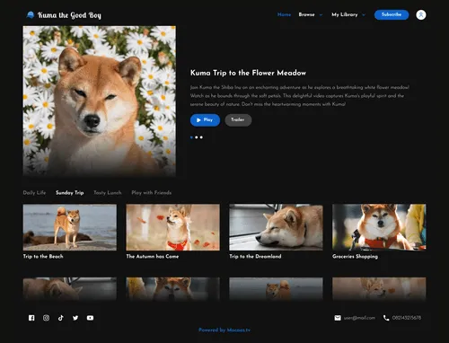
...a white label storefront that gives creators full ownership of their creation.
...a white label storefront that gives creators full ownership of their creation.

Mocaas bridges the gap between high-control global tools and high-reach social platforms, offering support for local payment methods.
Validating the Friction
Why was the upload process so difficult?
Why was the upload process so difficult?
To move beyond assumptions, I conducted interviews, card sorting exercises, and usability tests with Indonesian creators. By observing them interact with the original US-centric build, I learned that:

An overwhelming "22-field" form turned the simple task of uploading feel like a chore.
An overwhelming "22-field" form turned the simple task of uploading feel like a chore.
The original publishing interface was overwhelming, requiring users to navigate 22 fields across 6 separate tabs. During usability testing, creators felt compelled to fill out every box perfectly, even though only 4 fields were necessary to publish.
Terms like "slug" and "meta description" were confusing and created a language barrier.
Terms like "slug" and "meta description" were confusing and created a language barrier.

The platform use of developer-centric terms like 'slug,' 'meta description,' and other unclear terms led to confusion. Instead of concentrating on their content, they spent their energy trying to understand what the platform was asking of them.

Creators preferred a simple process that focus on content over complex web features.
Creators preferred a simple process that focus on content over complex web features.
Most creators wanted a straightforward, linear publishing flow that felt as effortless as posting a Reel or a YouTube video. High-level tools like SEO customization and layered monetization options were perceived as "noise" that got in the way.
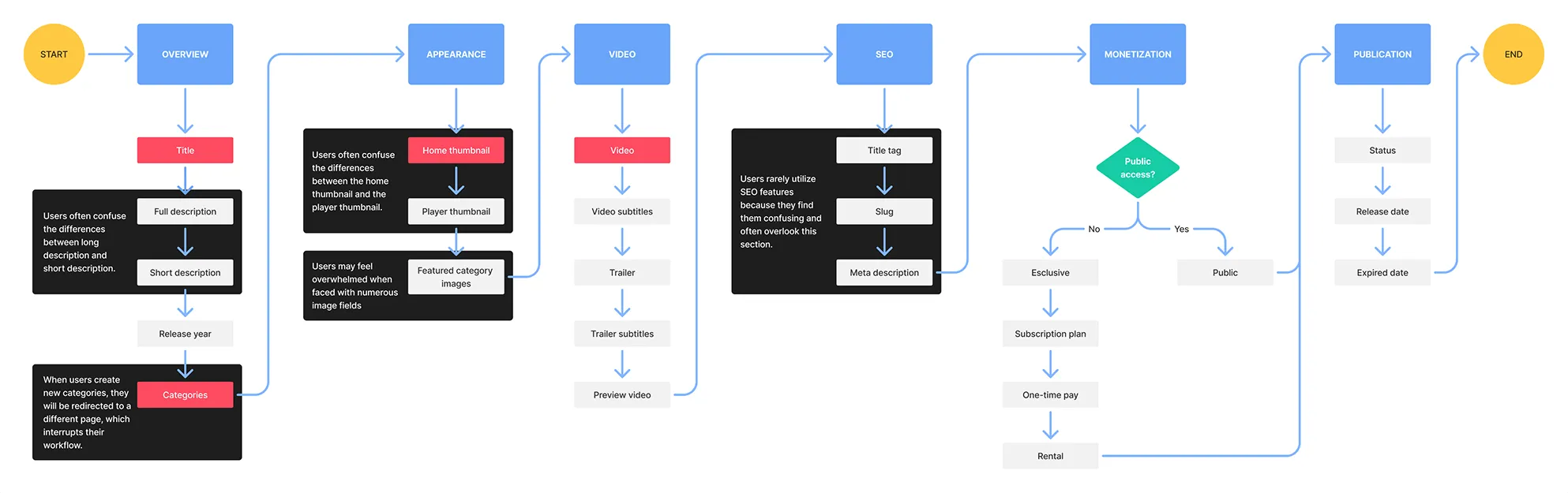
Design Solution 1: An "Upload-First" Workflow
Start with the video upload, automatically fulfilling required fields...
Start with the video upload, automatically fulfilling required fields...
Instead of forcing users to fill out a form before uploading, we started with the video file. We automatically generated the title and thumbnail from metadata.

...this shift allowed creators to publish with just one action.
...this shift allowed creators to publish with just one action.

By doing this we meet creators expectation for a fast and effortless experience.
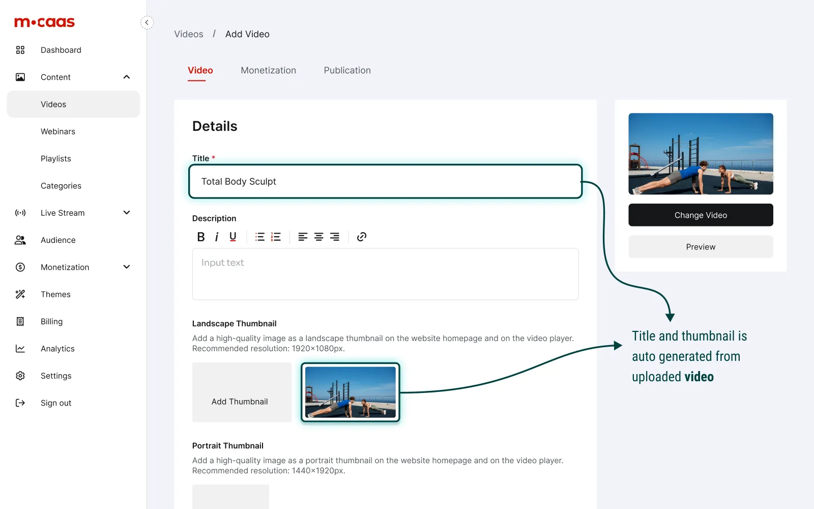
Design Solution 2: Reducing Cognitive Load
Consolidating 6 complex tabs into 3 intuitive sections based on mental models.
Consolidating 6 complex tabs into 3 intuitive sections based on mental models.
The original interface was fragmented, causing users to lose context. We grouped related tasks to create a linear, predictable path toward publishing.
Merging similar fields
Merging similar fields
We merged the full and short descriptions, player and thumbnail cover into a single fields, based on current user habits.

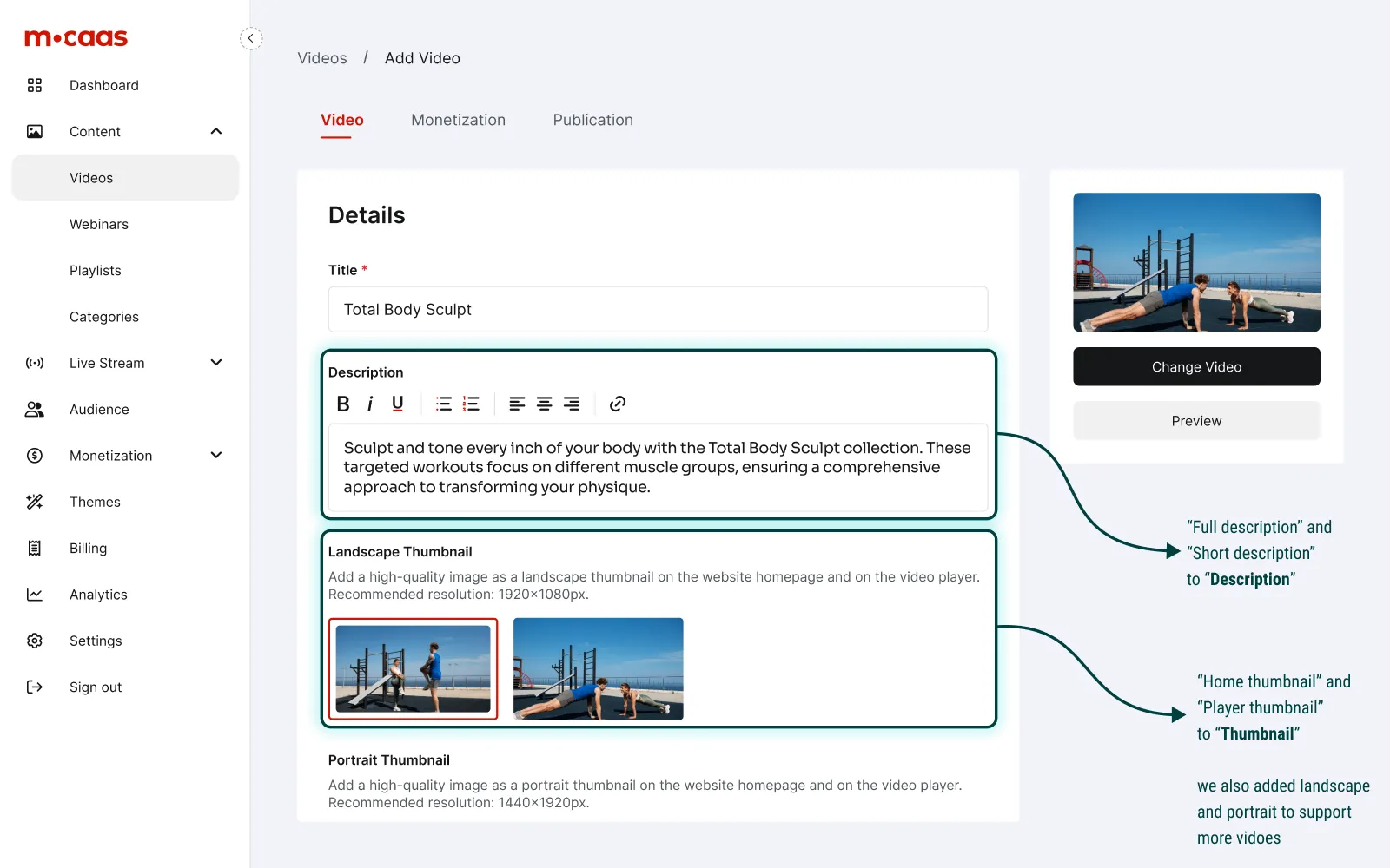
Hiding complexity
Hiding complexity
Fields like SEO and custom slugs were moved into a collapsed section accessible via a More button to keep the primary workspace clean.
Streamlined flow
Streamlined flow
We eliminated redirects when adding new categories by using modals. This allows users to add category directly in the flow.
Design Solution 3: Familiar Visual
Prioritizing the video with a persistent sidebar, inspired by familiar platforms.
Prioritizing the video with a persistent sidebar, inspired by familiar platforms.
We introduced a new layout featuring a sticky video preview on the right side of the screen that remains visible across all tabs. Inspired by the YouTube interface creators already know, this ensures the focus stays on the video itself and provides immediate visual feedback of any changes made.
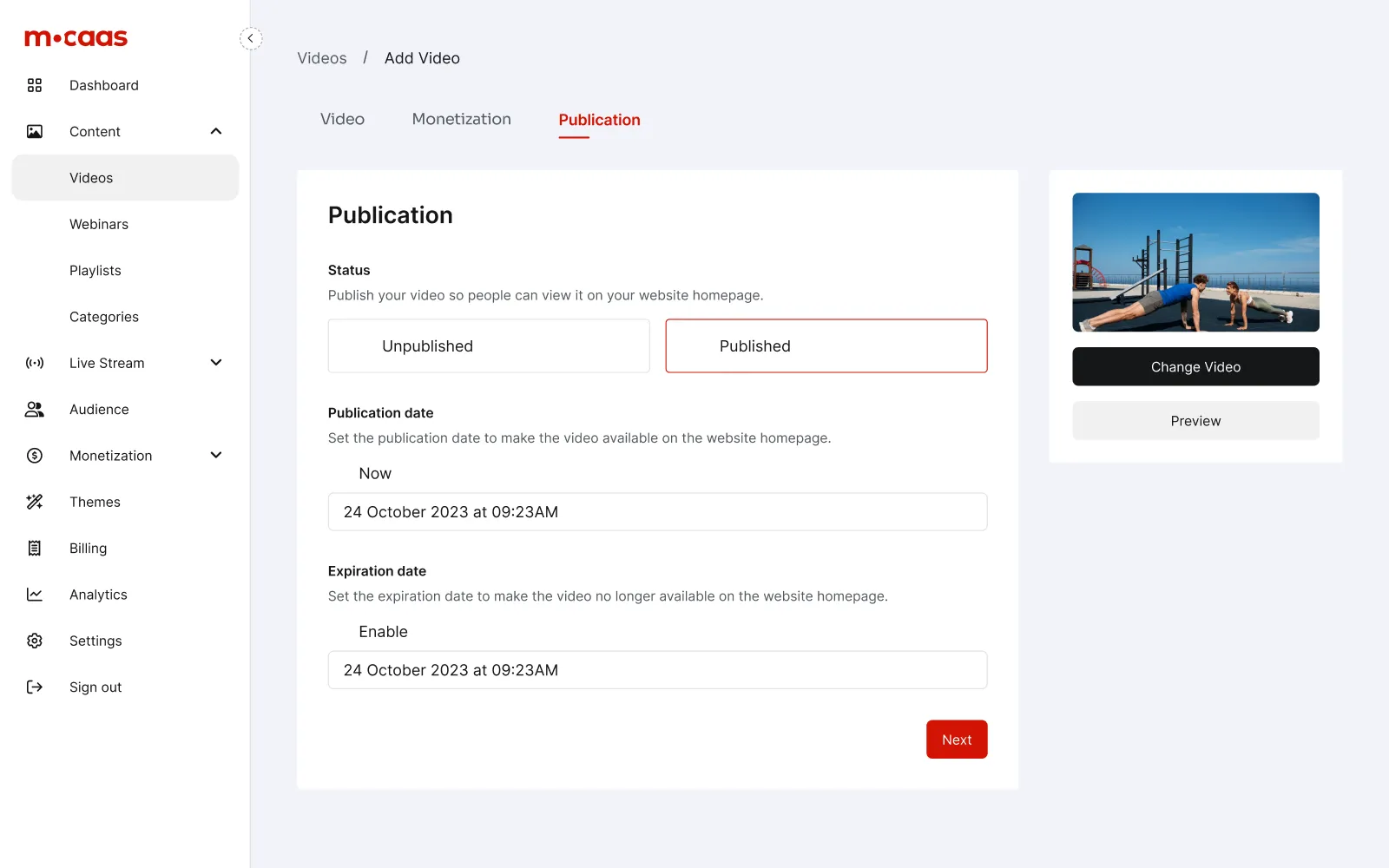
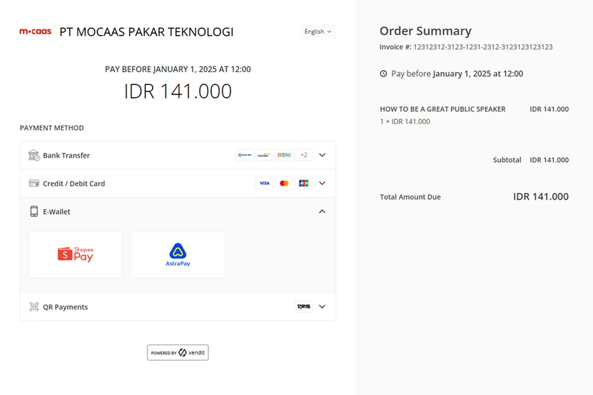
Design Solution 4: Local Payment Support
Integrating local payment to bridge the gap between global and local access.
Integrating local payment to bridge the gap between global and local access.
We prioritized ShoopePay, OVO, and Dana over credit cards. This keep the storefront looked professional, while the transaction accessible for Indonesia's market.
Measuring the Results
2.36× faster completion with a workflow built for creators.
2.36× faster completion with a workflow built for creators.
We optimized the publishing flow to remove technical friction, allowing creators to spend less time managing settings and more time building their digital brand.

Increased user confidence
During validation, creators noted that the interface felt familiar and simplified terms reduced the learning curve.

Zero redirect
The implementation of modals and the simplified "Advanced" section kept creators focused, reducing the cognitive strain of navigation.
What I Learned
Simplicity is a result, not a starting point.
Simplicity is a result, not a starting point.
My job as a designer is to simplifying the complexity so the experience feels effortless for the creator. Great products fit. They solve the user's needs without the noise.

Prioritize clarity
More isn’t always better. Restructured the form taught me to prioritize what users need and remove distractions .

Design for familiarity
Aligning with the users’ mental model boosts usability and trust. By doing this, we made the transition feel natural.